Fracture from Zeel Sanatkumar
Thursday, 29 December 2016
Tuesday, 20 December 2016
Monday, 19 December 2016
Friday, 16 December 2016
Pitch: The Market
Logline: A disease is spreading across the world and no one is able to cure it slowly everyone starts to die.

 This
is the feedback I had received from my classmates during the pitch. It was very
useful because I was able to make improvements to make it more clear for my
audience.
This
is the feedback I had received from my classmates during the pitch. It was very
useful because I was able to make improvements to make it more clear for my
audience.
Pitch : Fracture
Logline : The life of a female detective attempting to hunt down her twin sister, a serial killer, who constantly outwits her.


Thursday, 15 December 2016
Wednesday, 14 December 2016

Monday, 12 December 2016
Job Roles

(Reference https://www.prospects.ac.uk/job-profiles/production-designer-theatre-television-film )
(Reference http://creativeskillset.org/job_roles/737_production_designer )
Saturday, 10 December 2016

David Ayer- Thriller Director Analysis

Please click on the image above to view a website about David Fincher( Director Analysis) that i have created.

Thursday, 8 December 2016
Wednesday, 7 December 2016
Thriller Typography
Studying the typography makes us understand the common conventions and reoccurring themes of writing that come up in thriller openings so that we can add it to our own openings.
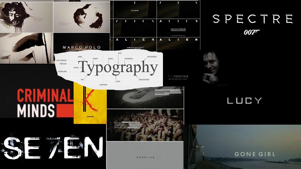
The typography from the title of the film Se7en creates mystery through the use of smudges and smears from the letters thus making the audience question whether a criminal is involved as the typography is suitable for a crime thriller. The colour white is associated with innocence and purity however this contrasts with the smudged lettering which symbolises crime and danger and the size of the typography which is small to have a greater impact on the audience. Therefore it may indicate that the crimes committed effect innocent lives.
Shutter Island: The typography used is set in a bold, san-serif font, and is red. The style of the fonts looks like the text has been blurred. This connotes that the film involves hidden identities or actions that should not be scene. The large font size and the colour of the text makes the title stand out from the background images. The text has a large font size adding to the clearness and boldness of the title. The colour red is associated with anger, blood and danger which connotes that this thriller film involves action and murder.
Many of the films shown above are almost always bold and sans-serif which connote seriousness as it looks simple yet effective being uncomplicated unlike serif fonts.They're size immediately grasps the viewers attention and unmissable complementing the overall aura of the movie. The use of dark colours on white backgrounds fit in perfectly with the common conventions of a thriller/crime film showing us they have rather extreme connotations portraying both power and dominance.
Distorted and sharp typography like the one used in the mood board above will help the audience easily recognise the film as a crime-thriller.
Sunday, 4 December 2016
Friday, 2 December 2016
Thursday, 1 December 2016
Subscribe to:
Posts (Atom)